| xlsgen > overview > Outliers |

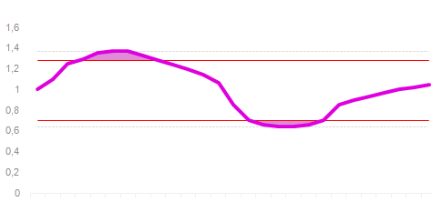
Chart outliers is a unique chart in xlsgen for showing data outside a predefined or dynamically calculated range, called the normal range. Such data outside the normal range are called outliers.
When you pass a percent as parameter for showing outliers, the range is automatically calculated in order to categorize data points according to their values. By default the value of this parameter is 10%, which means 5% of top values and 5% of bottom values are categorized as outliers and shown as such using an area above a red line, and an area below another red line, respectively.
The red lines identify the boundaries of that range. The dotted lines are simply the minimum and maximum in the data set.
| C++ code |
xlsgen::IXlsChartPtr chart = wksht->NewChart(xlsgen::charttype_outliers, 4, 3, 18, 8); chart->DataSource->Range = L"R1C2:R3C6"; chart->CustomProperties->OutlierPercent = 40; // show 40% of outliers |
Whenever the red lines must be manually set, xlsgen has the corresponding properties to be set.

In this example, setting the bottom redline to 0.6 implies there will be no bottom outliers because the redline is set below the minimum value in the dataset.
| C++ code |
xlsgen::IXlsChartPtr chart = wksht->NewChart(xlsgen::charttype_outliers, 4, 3, 18, 8); chart->DataSource->Range = L"R1C2:R3C6"; chart->CustomProperties->OutlierAbsoluteMaximum = 1.2; chart->CustomProperties->OutlierAbsoluteMinimum = 0.6; |
xlsgen documentation. © ARsT Design all rights reserved.