| xlsgen > overview > Template demo |
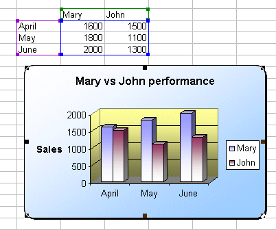
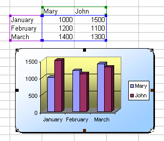
In this step-by-step demo, we'll use a combination of Excel charts and xlsgen to produce the Excel workbook that fits our need. We want a chart report to compare the sales performance of Mary and John over a three month period. Alternatively, we want to reuse the code and template for the next quarter. The resulting workbook is presented below :
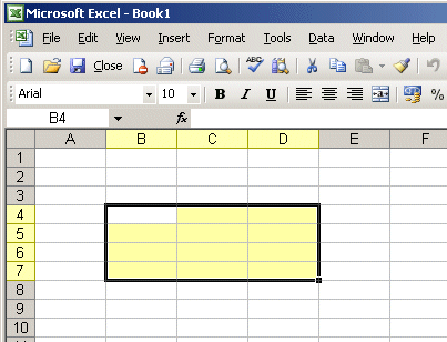
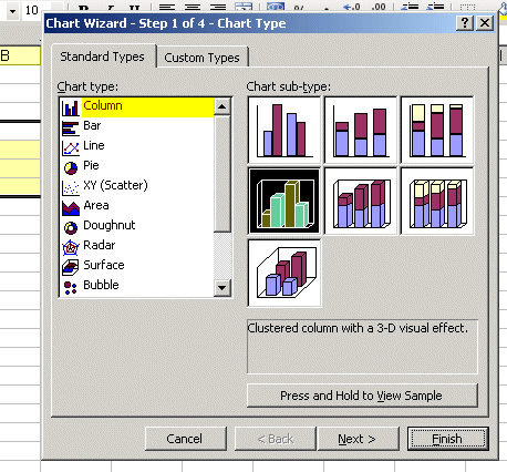

ChartTemplate.xls. Close the workbook and put that file in an appropriate folder. :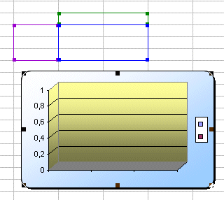
| C/C++ code |
// The following code creates an Excel workbook using an existing
// Excel workbook that has a chart.
{
  xlsgen::IXlsEnginePtr engine( __uuidof(xlsgen::CoXlsEngine) );

  xlsgen::IXlsWorkbookPtr wbk;
  wbk = engine->Open( L"ChartTemplate.xls", L"mychart.xls" );


  xlsgen::IXlsWorksheetPtr wksht_existing;
  wksht_existing = wbk->WorksheetByIndex[1];

  // row titles
  wksht_existing->Label[5][2] = L"January";
  wksht_existing->Label[6][2] = L"February";
  wksht_existing->Label[7][2] = L"March";

  // col titles
  wksht_existing->Label[4][3] = L"Mary";
  wksht_existing->Label[4][4] = L"John";

  // data
  wksht_existing->Number[5][3] = 1000;
  wksht_existing->Number[6][3] = 1200;
  wksht_existing->Number[7][3] = 1400;

  wksht_existing->Number[5][4] = 1500;
  wksht_existing->Number[6][4] = 1100;
  wksht_existing->Number[7][4] = 1300;


  wbk->Close();
}
|
ChartTemplate2.xls and put that file in an appropriate folder. We end up with the following chart :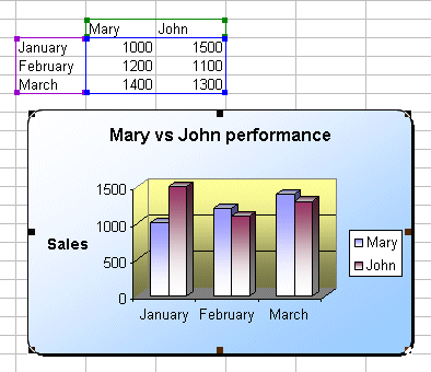
| C/C++ code |
// The following code creates an Excel workbook using an existing
// Excel workbook that has a chart.
// The difference with the code above is that it reuses another template
// that takes advantage of an existing data source to apply formatting
// to the chart itself, and again make changes to it using xlsgen.
{
  xlsgen::IXlsEnginePtr engine( __uuidof(xlsgen::CoXlsEngine) );

  xlsgen::IXlsWorkbookPtr wbk;
  wbk = engine->Open( L"ChartTemplate2.xls", L"mychart2.xls" );


  xlsgen::IXlsWorksheetPtr wksht_existing;
  wksht_existing = wbk->WorksheetByIndex[1];

  // row titles
  wksht_existing->Label[5][2] = L"April";
  wksht_existing->Label[6][2] = L"May";
  wksht_existing->Label[7][2] = L"June";

  // col titles
  wksht_existing->Label[4][3] = L"Mary";
  wksht_existing->Label[4][4] = L"John";

  // data
  wksht_existing->Number[5][3] = 1600;
  wksht_existing->Number[6][3] = 1800;
  wksht_existing->Number[7][3] = 2000;

  wksht_existing->Number[5][4] = 1500;
  wksht_existing->Number[6][4] = 1100;
  wksht_existing->Number[7][4] = 1300;


  wbk->Close();
}
|

Charts are attached to a Data source. Whenever you make a change to the attached Data source, for instance one value in a cell, the charts automatically reflect it. That's only partially true however, unless you use Dynamic Data sources which is much less known a mechanism and is what I intend to explain in the remainder of this post.
Let's assume you created the chart by making a cell selection, then clicked the chart toolbar button and then clicked Finish. If you add a new row to the Data source, then the chart won't reflect it. The reason why is that the range selection is translated to its numerical boundaries and stored like this. When you add a new row, or a new column, the chart has no way to know that you are making a change to the Data source since the change is made outside the boundaries.
One way to fix this is to use Excel 2003 lists. But since lists by no mean can represent a general purpose Data source, and also implies that you are using Excel 2003 in the first place (which according to public figures from Microsoft, is the case for as little as 15% of Office users out there), I don't think it's interesting to explain further. Why Excel 2003 lists are limited is that they are contiguous rows of cells, and as such cannot represent general purpose Data sources which can be made of an arbitrary number of non-contiguous rows or columns.
Another way to fix this, a better way which happens to works with all Excel versions, is to use named ranges. The named range thing provides an abstraction level which is sufficient to attach a chart to Data source being known as a name, and then let Excel store the definition of the range separately.
But there is a bug in the Excel chart wizard. When you right-click a chart and select "Data source...", you get a dialog box with two tabs, one is "Data Range", another is "Series". The Data Range tab is meant to reflect the bounding box of the Data source, and the bug is that if you enter a named range there, then Excel will translate it to its numerical representation. You need to click the Series tab instead, and have to go through a more tedious definition process where Data labels, Series titles, and actual Series values can be named appropriately. One or more of the boxes can be filled with named ranges. The point is, the named ranges will be preserved and thus allow the chart to reflect any change you make.
Here is how it works in practice. Whenever you insert a new row in the Data source, you simply need to update the definition of the named range. The good side of all this is that both the row edition and named range definition can be done with small concise xlsgen code.
As complex as it may sound, combining charts with named ranges gives a very compelling way to have charts be used effectively, efficiently, and dynamically in template scenarios. The point being, you don't need to access any of the chart Data source API only to reflect the changes. All of this is automatically provided by the level of abstraction of the named range.
That is by the way one example. You can do the same with pivot tables, pivot charts and other objects. Practically anything.
As a matter of fact, even the action of updating the named range definition to reflect the fact that you inserted a new row, can be automatically taken into account. That's done with a special case of named range known as dynamic named range. Instead of using a numerical definition for a named range, say =A1:B4, you can use a formula which happens to compute boundaries based on actual cell content. As you insert rows, the formulas will get updated, reflected in the named range, and in turn reflected in the chart itself. Here is an example of dynamic named range you may want to use :
Where column A contains a title in A1 and values in A2, A3, ...
Create a named range "myrange" with such definition. Then create a chart, edit its Data source, go in the Series tab, then click on the Values edit box and type : Sheet1!myrange, and click OK. Your chart is now ready to accomodate both value changes in cells within the boundary as well as row insertion.
xlsgen documentation. © ARsT Design all rights reserved.