 |
| xlsgen > overview > Excel 2016 charts |
 |
xlsgen supports all 7 new chart types introduced in Excel 2016 :
Waterfall charts

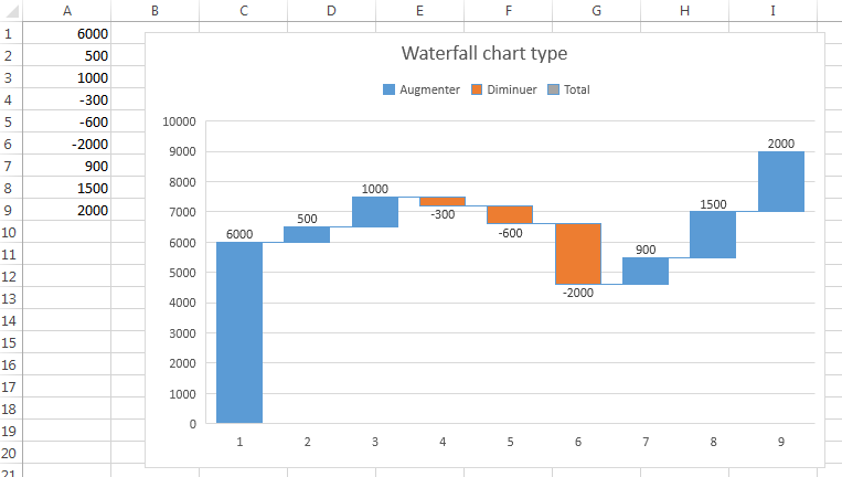
Waterfall charts in xlsgen
Waterfall charts can be used for showing differences between values. When the current value is higher than the previous value, a positive color is used (first color in the current theme). And when the current value is lower than the previous value, a negative color is used. By showing those color-coded differences over the entire series, it is possible to visualize how the value is evolving over time. Stock tick charts are often waterfall charts.
Special values can be used and formatted accordingly to rebase the differences, often for showing a total in the values. For this to work, a boolean property called WaterfallRebase in the IXlsChartDataElement interface is available, i.e. the i-th data point of a given series of values.
| Java code |
XlsChart chart = worksheet.NewChart(xlsgen.charttype_waterfall,
					     10, //row1
					     2, //col1
					     25, //row2
					     10 //col2
					     );

XlsChartDynamicDataSourceSeries s1 = chart.getDynamicDataSource().AddSerie();
s1.putSeriesValuesFormula("=Sheet1!$A$1:$A$9");
|
| VB code |
Dim chart As IXlsChart
Set chart = worksheet.NewChart(enumChartType.charttype_waterfall, _
					     10, _ 'row1
					     2,  _ 'col1
					     25, _ 'row2
					     10  _ 'col2
					     )

Dim s1 As IXlsChartDynamicDataSourceSeries
Set s1 = chart.DynamicDataSource.AddSerie
s1.SeriesValuesFormula = "=Sheet1!$A$1:$A$9"
|
| C# code |
IXlsChart chart = worksheet.NewChart(enumChartType.charttype_waterfall,
					     10, //row1
					     2, //col1
					     25, //row2
					     10 //col2
					     );

IXlsChartDynamicDataSourceSeries s1 = chart.DynamicDataSource.AddSerie();
s1.SeriesValuesFormula = "=Sheet1!$A$1:$A$9";
|
| C/C++ code |
xlsgen::IXlsChartPtr chart = worksheet->NewChart(xlsgen::charttype_waterfall,
					     10, //row1
					     2, //col1
					     25, //row2
					     10 //col2
					     );

xlsgen::IXlsChartDynamicDataSourceSeriesPtr s1 = chart->DynamicDataSource->AddSerie();
s1->SeriesValuesFormula = L"=Sheet1!$A$1:$A$9";
|
Box and whisker charts

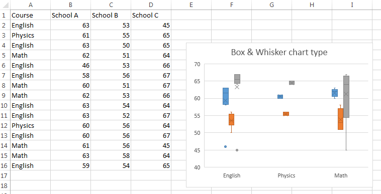
Box & Whisker charts in xlsgen
Box and whisker charts display the dispersion of values in one or more series. Boxes represent main quartiles, lines represent the dispersion of values outside the main quartiles (the larger the lines, the most varying the values), X signs show the mean and dots represent outliers (i.e. values outside the most meaningful quartiles). Box and whisker charts can be put to great use in statistical and financial charts, notably, in addition or in contrast of histogram charts.
| Java code |
XlsChart chart = worksheet.NewChart(xlsgen.charttype_boxwhisker,
					     10, //row1
					     2, //col1
					     25, //row2
					     10 //col2
					     );

XlsChartDynamicDataSourceSeries s1 = chart.getDynamicDataSource().AddSerie();
s1.putSeriesValuesFormula("=Sheet1!$B$2:$B$16");
s1.putDataLabelsFormula("=Sheet1!$A$2:$A$16");

XlsChartDynamicDataSourceSeries s2 = chart.getDynamicDataSource().AddSerie();
s2.putSeriesValuesFormula("=Sheet1!$C$2:$C$16");
s2.putDataLabelsFormula("=Sheet1!$A$2:$A$16");

XlsChartDynamicDataSourceSeries s3 = chart.getDynamicDataSource().AddSerie();
s3.putSeriesValuesFormula("=Sheet1!$D$2:$D$16");
s3.putDataLabelsFormula("=Sheet1!$A$2:$A$16");

chart.getMainTitle().putLabel("Box and Whisker chart type");
|
| VB code |
Dim chart As IXlsChart
Set chart = worksheet.NewChart(enumChartType.charttype_boxwhisker, _
					     10, _ 'row1
					     2,  _ 'col1
					     25, _ 'row2
					     10  _ 'col2
					     )

Dim s1 As IXlsChartDynamicDataSourceSeries
Set s1 = chart.DynamicDataSource.AddSerie
s1.SeriesValuesFormula = "=Sheet1!$B$2:$B$16"
s1.DataLabelsFormula   = "=Sheet1!$A$2:$A$16"

Dim s2 As IXlsChartDynamicDataSourceSeries
Set s2 = chart.DynamicDataSource.AddSerie
s2.SeriesValuesFormula = "=Sheet1!$C$2:$C$16"
s2.DataLabelsFormula   = "=Sheet1!$A$2:$A$16"

Dim s3 As IXlsChartDynamicDataSourceSeries
Set s3 = chart.DynamicDataSource.AddSerie
s3.SeriesValuesFormula = "=Sheet1!$D$2:$D$16"
s3.DataLabelsFormula   = "=Sheet1!$A$2:$A$16"

chart.MainTitle.Label = "Box and Whisker chart type"
|
| C# code |
IXlsChart chart = worksheet.NewChart(enumChartType.charttype_boxwhisker,
					     10, //row1
					     2, //col1
					     25, //row2
					     10 //col2
					     );

IXlsChartDynamicDataSourceSeries s1 = chart.DynamicDataSource.AddSerie();
s1.SeriesValuesFormula = "=Sheet1!$B$2:$B$16";
s1.DataLabelsFormula   = "=Sheet1!$A$2:$A$16";

IXlsChartDynamicDataSourceSeries s2 = chart.DynamicDataSource.AddSerie();
s2.SeriesValuesFormula = "=Sheet1!$C$2:$C$16";
s2.DataLabelsFormula   = "=Sheet1!$A$2:$A$16";

IXlsChartDynamicDataSourceSeries s3 = chart.DynamicDataSource.AddSerie();
s3.SeriesValuesFormula = "=Sheet1!$D$2:$D$16";
s3.DataLabelsFormula   = "=Sheet1!$A$2:$A$16";

chart.MainTitle.Label = "Box and Whisker chart type";
|
| C/C++ code |
xlsgen::IXlsChartPtr chart = worksheet->NewChart(xlsgen::charttype_boxwhisker,
					     10, //row1
					     2, //col1
					     25, //row2
					     10 //col2
					     );

xlsgen::IXlsChartDynamicDataSourceSeriesPtr s1 = chart->DynamicDataSource->AddSerie();
s1->SeriesValuesFormula = L"=Sheet1!$B$2:$B$16";
s1->DataLabelsFormula   = L"=Sheet1!$A$2:$A$16";

xlsgen::IXlsChartDynamicDataSourceSeriesPtr s2 = chart->DynamicDataSource->AddSerie();
s2->SeriesValuesFormula = L"=Sheet1!$C$2:$C$16";
s2->DataLabelsFormula   = L"=Sheet1!$A$2:$A$16";

xlsgen::IXlsChartDynamicDataSourceSeriesPtr s3 = chart->DynamicDataSource->AddSerie();
s3->SeriesValuesFormula = L"=Sheet1!$D$2:$D$16";
s3->DataLabelsFormula   = L"=Sheet1!$A$2:$A$16";

chart->MainTitle->Label = L"Box and Whisker chart type";
|
Treemap charts

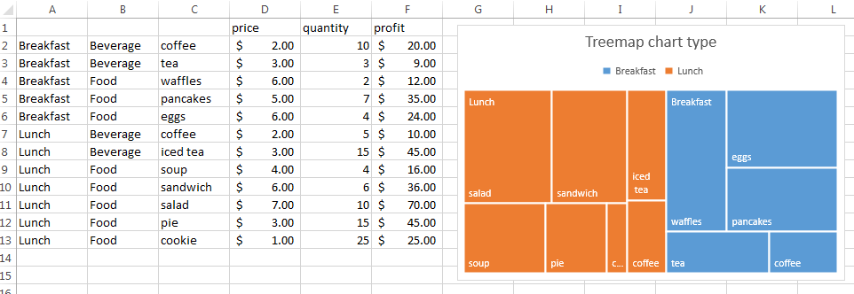
Treemap charts in xlsgen
Treemap charts can be used to display values which are hierarchical in nature, using nested rectangles.
In the example above, we have a single series of values, which is the price column, and we would like to show how breakfasts are sorted out by price, and how lunches are sorted out by price. The display builds two separate collections from the same series, based on names from column A and column C, sorts them, according to column D, then displays the nested rectangles.
| Java code |
XlsChart chart = worksheet.NewChart(xlsgen.charttype_treemap,
					     10, //row1
					     2, //col1
					     25, //row2
					     10 //col2
					     );

XlsChartDynamicDataSourceSeries s1 = chart.getDynamicDataSource().AddSerie();
s1.putSeriesValuesFormula("=Sheet1!$D$2:$D$13");
s1.putDataLabelsFormula("=Sheet1!$A$2:$C$13");
|
| VB code |
Dim chart As IXlsChart
Set chart = worksheet.NewChart(enumChartType.charttype_treemap, _
					     10, _ 'row1
					     2,  _ 'col1
					     25, _ 'row2
					     10  _ 'col2
					     )

Dim s1 As IXlsChartDynamicDataSourceSeries
Set s1 = chart.DynamicDataSource.AddSerie
s1.SeriesValuesFormula = "=Sheet1!$D$2:$D$13"
s1.DataLabelsFormula   = "=Sheet1!$A$2:$C$13"
|
| C# code |
IXlsChart chart = worksheet.NewChart(enumChartType.charttype_treemap,
					     10, //row1
					     2, //col1
					     25, //row2
					     10 //col2
					     );

IXlsChartDynamicDataSourceSeries s1 = chart.DynamicDataSource.AddSerie();
s1.SeriesValuesFormula = "=Sheet1!$D$2:$D$13";
s1.DataLabelsFormula   = "=Sheet1!$A$2:$C$13";
|
| C/C++ code |
xlsgen::IXlsChartPtr chart = worksheet->NewChart(xlsgen::charttype_treemap,
					     10, //row1
					     2, //col1
					     25, //row2
					     10 //col2
					     );

xlsgen::IXlsChartDynamicDataSourceSeriesPtr s1 = chart->DynamicDataSource->AddSerie();
s1->SeriesValuesFormula = L"=Sheet1!$D$2:$D$13";
s1->DataLabelsFormula   = L"=Sheet1!$A$2:$C$13";
|
Sunburst charts

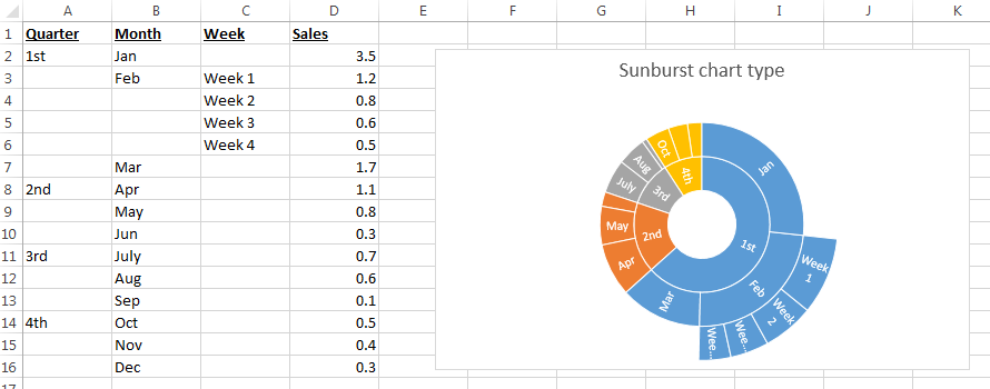
Sunburst charts in xlsgen
Sunburst chart is another chart type for showing data which is hierarchical in nature. It is made of multiple rings which reflects the hierarchy, and as such is different from a doughnut chart or exploded pie chart, which xlsgen also supports. A segment of the inner circle bears a hierarchical relationship to those segments of the outer circle which lie within the angular sweep of the parent segment. The multiple rings are created from a single series of values associated to multiple columns of categories, reflecting the hierarchies, for instance a quarter/month/week hierarchy as in the example above.
| Java code |
XlsChart chart = worksheet.NewChart(xlsgen.charttype_sunburst,
					     10, //row1
					     2, //col1
					     25, //row2
					     10 //col2
					     );

XlsChartDynamicDataSourceSeries s1 = chart.getDynamicDataSource().AddSerie();
s1.putSeriesValuesFormula("=Sheet1!$D$2:$D$16");
s1.putDataLabelsFormula("=Sheet1!$A$2:$C$16");
|
| VB code |
Dim chart As IXlsChart
Set chart = worksheet.NewChart(enumChartType.charttype_sunburst, _
					     10, _ 'row1
					     2,  _ 'col1
					     25, _ 'row2
					     10  _ 'col2
					     )

Dim s1 As IXlsChartDynamicDataSourceSeries
Set s1 = chart.DynamicDataSource.AddSerie
s1.SeriesValuesFormula = "=Sheet1!$D$2:$D$16"
s1.DataLabelsFormula   = "=Sheet1!$A$2:$C$16"
|
| C# code |
IXlsChart chart = worksheet.NewChart(enumChartType.charttype_sunburst,
					     10, //row1
					     2, //col1
					     25, //row2
					     10 //col2
					     );

IXlsChartDynamicDataSourceSeries s1 = chart.DynamicDataSource.AddSerie();
s1.SeriesValuesFormula = "=Sheet1!$D$2:$D$16";
s1.DataLabelsFormula   = "=Sheet1!$A$2:$C$16";
|
| C/C++ code |
xlsgen::IXlsChartPtr chart = worksheet->NewChart(xlsgen::charttype_sunburst,
					     10, //row1
					     2, //col1
					     25, //row2
					     10 //col2
					     );

xlsgen::IXlsChartDynamicDataSourceSeriesPtr s1 = chart->DynamicDataSource->AddSerie();
s1->SeriesValuesFormula = L"=Sheet1!$D$2:$D$16";
s1->DataLabelsFormula   = L"=Sheet1!$A$2:$C$16";
|
Histogram charts

Histogram charts in xlsgen
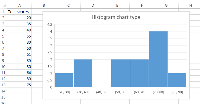
While Excel 2016 introduces native histograms, xlsgen has been supporting histograms for some time already. For the record, histograms were already available in Excel in the past in the Analysis toolpak add-in, unchecked by default, but were cumbersume to use to say the least (special columns had to be created, and so on). Because there are xlsgen histograms, and now Excel 2016 histograms, it was chosen to differentiate them by name. So you would invoke charttype_histogram for xlsgen histograms and charttype_histogram2016 for Excel 2016 histograms.
More details about Excel 2016 histograms. There are two histogram types : those working with numbers and those working with strings (HistogramByCategory property). The goal of an histogram is to show the frequency (y-axis) of values in a series. Because values may be close to each other, Excel 2016 creates this concept of bin which is an interval inside of which all values are counted as if they were the same value, thereby allowing a more practical occurence frequency calculation. The object model allows to choose either the bin width (HistogramBinWidth), or the number of bins in the chart (HistogramBinCount). These are options, they do not have to be set for the histogram to work by default. In addition, the extreme values can have their own bin if you set the overflow and underflow values (respectively HistogramOverflowValue and HistogramUnderflowValue in the IXlsChartCustomProperties interface).
| Java code |
// histogram of numbers

        XlsWorksheet wksht001 = workbook.AddWorksheet( "Sheet1" );

        wksht001.putLabel(1,1, "Category A");
        wksht001.putNumber(1,2, 20000);

        wksht001.putLabel(2,1, "Category B");
        wksht001.putNumber(2,2, 18000);

        wksht001.putLabel(3,1, "Category A");
        wksht001.putNumber(3,2, 25000);

        wksht001.putLabel(4,1, "Category D");
        wksht001.putNumber(4,2, 4000);

        wksht001.putLabel(5,1, "Category E");
        wksht001.putNumber(5,2, 16000);

        XlsChart chart1 = wksht001.NewChart(xlsgen.charttype_histogram2016,
		        			     10, //row1
        					     2, //col1
        					     25, //row2
        					     10 //col2
        					     );

        XlsChartDynamicDataSourceSeries s1 = chart1.getDynamicDataSource().AddSerie();
        s1.putSeriesValuesFormula("=Sheet1!$B$1:$B$5");
        s1.putDataLabelsFormula("=Sheet1!$A$1:$A$5");

        chart1.getCustomProperties().putHistogramBinWidth(5000.0);


// histogram of strings (Category A appears with a frequency of 2)

        XlsWorksheet wksht002 = workbook.AddWorksheet( "Sheet2" );

        wksht002.putLabel(1,1, "Category A");
        wksht002.putNumber(1,2, 1);

        wksht002.putLabel(2,1, "Category B");
        wksht002.putNumber(2,2, 1);

        wksht002.putLabel(3,1, "Category A");
        wksht002.putNumber(3,2, 1);

        wksht002.putLabel(4,1, "Category D");
        wksht002.putNumber(4,2, 1);

        wksht002.putLabel(5,1, "Category E");
        wksht002.putNumber(5,2, 1);

        XlsChart chart2 = wksht001.NewChart(xlsgen.charttype_histogram2016,
		        			     10, //row1
        					     2, //col1
        					     25, //row2
        					     10 //col2
        					     );

        XlsChartDynamicDataSourceSeries s2 = chart2.getDynamicDataSource().AddSerie();
        s2.putSeriesValuesFormula("=Sheet2!$B$1:$B$5");
        s2.putDataLabelsFormula("=Sheet2!$A$1:$A$5");

        chart2.getCustomProperties().putHistogramByCategory(true);
|
| VB code |
' histogram of numbers

        Dim wksht001 As IXlsWorksheet
        Set wksht001 = workbook.AddWorksheet( "Sheet1" )

        wksht001.Label(1,1) = "Category A"
        wksht001.Number(1,2) = 20000

        wksht001.Label(2,1) = "Category B"
        wksht001.Number(2,2) = 18000

        wksht001.Label(3,1) = "Category A"
        wksht001.Number(3,2) = 25000

        wksht001.Label(4,1) = "Category D"
        wksht001.Number(4,2) = 4000

        wksht001.Label(5,1) = "Category E"
        wksht001.Number(5,2) = 16000

        Dim chart1 As IXlsChart
        Set chart1 = wksht001.NewChart(enumChartType.charttype_histogram2016, _
                                                     10, _ 'row1
                                                     2,  _ 'col1
                                                     25, _ 'row2
                                                     10  _ 'col2
                                                     )

        Dim s1 As IXlsChartDynamicDataSourceSeries
        Set s1 = chart.DynamicDataSource.AddSerie
        s1.SeriesValuesFormula = "=Sheet1!$B$1:$B$5"
        s1.DataLabelsFormula   = "=Sheet1!$A$1:$A$5"

        chart1.CustomProperties.HistogramBinWidth = 5000.0


' histogram of strings (Category A appears with a frequency of 2)

        Dim wksht002 As IXlsWorksheetPtr
        Set wksht002 = workbook.AddWorksheet( "Sheet2" )

        wksht002.Label(1,1) = "Category A"
        wksht002.Number(1,2) = 1

        wksht002.Label(2,1) = "Category B"
        wksht002.Number(2,2) = 1

        wksht002.Label(3,1) = "Category A"
        wksht002.Number(3,2) = 1

        wksht002.Label(4,1) = "Category D"
        wksht002.Number(4,2) = 1

        wksht002.Label(5,1) = "Category E"
        wksht002.Number(5,2) = 1

        Dim chart2 As IXlsChart
        Set chart2 = wksht002.NewChart(enumChartType.charttype_histogram2016, _
                                                     10, _ 'row1
                                                     2,  _ 'col1
                                                     25, _ 'row2
                                                     10  _ 'col2
                                                     )

        Dim s2 As IXlsChartDynamicDataSourceSeries
        Set s2 = chart.DynamicDataSource.AddSerie
        s2.SeriesValuesFormula = "=Sheet2!$B$1:$B$5"
        s2.DataLabelsFormula   = "=Sheet2!$A$1:$A$5"

        chart2.CustomProperties.HistogramByCategory = True
|
| C# code |
// histogram of numbers

        IXlsWorksheet wksht001 = workbook.AddWorksheet( "Sheet1" );

        wksht001.set_Label(1,1, "Category A");
        wksht001.set_Number(1,2, 20000);

        wksht001.set_Label(2,1, "Category B");
        wksht001.set_Number(2,2, 18000);

        wksht001.set_Label(3,1, "Category A");
        wksht001.set_Number(3,2, 25000);

        wksht001.set_Label(4,1, "Category D");
        wksht001.set_Number(4,2, 4000);

        wksht001.set_Label(5,1, "Category E");
        wksht001.set_Number(5,2, 16000);

        IXlsChart chart1 = wksht001.NewChart(enumChartType.charttype_histogram2016,
                                                     10, //row1
                                                     2, //col1
                                                     25, //row2
                                                     10 //col2
                                                     );

        IXlsChartDynamicDataSourceSeries s1 = chart1.DynamicDataSource.AddSerie();
        s1.SeriesValuesFormula = "=Sheet1!$B$1:$B$5";
        s1.DataLabelsFormula   = "=Sheet1!$A$1:$A$5";

        chart1.CustomProperties.HistogramBinWidth = 5000.0;


// histogram of strings (Category A appears with a frequency of 2)

        IXlsWorksheet wksht002 = workbook.AddWorksheet( "Sheet2" );

        wksht002.set_Label(1,1, "Category A");
        wksht002.set_Number(1,2, 1);

        wksht002.set_Label(2,1, "Category B");
        wksht002.set_Number(2,2, 1);

        wksht002.set_Label(3,1, "Category A");
        wksht002.set_Number(3,2, 1);

        wksht002.set_Label(4,1, "Category D");
        wksht002.set_Number(4,2, 1);

        wksht002.set_Label(5,1, "Category E");
        wksht002.set_Number(5,2, 1);

        IXlsChart chart2 = wksht002.NewChart(enumChartType.charttype_histogram2016,
                                                     10, //row1
                                                     2, //col1
                                                     25, //row2
                                                     10 //col2
                                                     );

        IXlsChartDynamicDataSourceSeries s2 = chart2.DynamicDataSource.AddSerie();
        s2.SeriesValuesFormula = "=Sheet2!$B$1:$B$5";
        s2.DataLabelsFormula   = "=Sheet2!$A$1:$A$5";

        chart2.CustomProperties.HistogramByCategory = true;
|
| C/C++ code |
// histogram of numbers

        xlsgen::IXlsWorksheetPtr wksht001 = workbook->AddWorksheet( L"Sheet1" );

        wksht001->Label[1][1] = L"Category A";
        wksht001->Number[1][2] = 20000;

        wksht001->Label[2][1] = L"Category B";
        wksht001->Number[2][2] = 18000;

        wksht001->Label[3][1] = L"Category A";
        wksht001->Number[3][2] = 25000;

        wksht001->Label[4][1] = L"Category D";
        wksht001->Number[4][2] = 4000;

        wksht001->Label[5][1] = L"Category E";
        wksht001->Number[5][2] = 16000;

        xlsgen::IXlsChartPtr chart1 = wksht001->NewChart(xlsgen::charttype_histogram2016,
                                                     10, //row1
                                                     2, //col1
                                                     25, //row2
                                                     10 //col2
                                                     );

        xlsgen::IXlsChartDynamicDataSourceSeriesPtr s1 = chart1->DynamicDataSource->AddSerie();
        s1->SeriesValuesFormula = L"=Sheet1!$B$1:$B$5";
        s1->DataLabelsFormula   = L"=Sheet1!$A$1:$A$5";

        chart1->CustomProperties->HistogramBinWidth = 5000.0;


// histogram of strings (Category A appears with a frequency of 2)

        xlsgen::IXlsWorksheetPtr wksht002 = workbook->AddWorksheet( L"Sheet2" );

        wksht002->Label[1][1] = L"Category A";
        wksht002->Number[1][2] = 1;

        wksht002->Label[2][1] = L"Category B";
        wksht002->Number[2][2] = 1;

        wksht002->Label[3][1] = L"Category A";
        wksht002->Number[3][2] = 1;

        wksht002->Label[4][1] = L"Category D";
        wksht002->Number[4][2] = 1;

        wksht002->Label[5][1] = L"Category E";
        wksht002->Number[5][2] = 1;

        xlsgen::IXlsChartPtr chart2 = wksht002->NewChart(xlsgen::charttype_histogram2016,
                                                     10, //row1
                                                     2, //col1
                                                     25, //row2
                                                     10 //col2
                                                     );

        xlsgen::IXlsChartDynamicDataSourceSeriesPtr s2 = chart2->DynamicDataSource->AddSerie();
        s2->SeriesValuesFormula = L"=Sheet2!$B$1:$B$5";
        s2->DataLabelsFormula   = L"=Sheet2!$A$1:$A$5";

        chart2->CustomProperties->HistogramByCategory = TRUE;
|
Pareto charts

Pareto charts in xlsgen
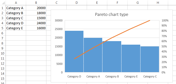
Pareto charts is a type of chart that contains both bars and a line graph, where individual values are represented in descending order by bars, and the cumulative total is represented by the line. The purpose of the Pareto chart is to highlight the most important among a (typically large) set of factors.
| Java code |
XlsChart chart = worksheet.NewChart(xlsgen.charttype_pareto,
					     10, //row1
					     2, //col1
					     25, //row2
					     10 //col2
					     );

XlsChartDynamicDataSourceSeries s1 = chart.getDynamicDataSource().AddSerie();
s1.putSeriesValuesFormula("=Sheet1!$B$1:$B$5");
s1.putDataLabelsFormula("=Sheet1!$A$1:$A$5");
|
| VB code |
Dim chart As IXlsChart
Set chart = worksheet.NewChart(enumChartType.charttype_pareto, _
					     10, _ 'row1
					     2,  _ 'col1
					     25, _ 'row2
					     10  _ 'col2
					     )

Dim s1 As IXlsChartDynamicDataSourceSeries
Set s1 = chart.DynamicDataSource.AddSerie
s1.SeriesValuesFormula = "=Sheet1!$B$1:$B$5"
s1.DataLabelsFormula   = "=Sheet1!$A$1:$A$5"
|
| C# code |
IXlsChart chart = worksheet.NewChart(enumChartType.charttype_pareto,
					     10, //row1
					     2, //col1
					     25, //row2
					     10 //col2
					     );

IXlsChartDynamicDataSourceSeries s1 = chart.DynamicDataSource.AddSerie();
s1.SeriesValuesFormula = "=Sheet1!$B$1:$B$5";
s1.DataLabelsFormula   = "=Sheet1!$A$1:$A$5";
|
| C/C++ code |
xlsgen::IXlsChartPtr chart = worksheet->NewChart(xlsgen::charttype_pareto,
					     10, //row1
					     2, //col1
					     25, //row2
					     10 //col2
					     );

xlsgen::IXlsChartDynamicDataSourceSeriesPtr s1 = chart->DynamicDataSource->AddSerie();
s1->SeriesValuesFormula = L"=Sheet1!$B$1:$B$5";
s1->DataLabelsFormula   = L"=Sheet1!$A$1:$A$5";
|
Funnel charts

Funnel charts in xlsgen
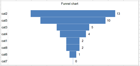
A funnel chart displays values as progressively decreasing proportions.
A typical example of a funnel chart starts with the sales leads on top, then down to the qualified leads, the hot leads and the closed deals. A business is bound to lose some number of potential deals at each step in the sales process and this is represented by the narrowing sections as you move from the top section (the widest) to the bottom section (the narrowest.) This allows executives to see how effective the sales team is in turning a sales lead into a closed deal. A sales funnel chart can also be used to quickly communicate your organization's sales process to new members of the sales team or other interested parties.
| Java code |
XlsChart chart = worksheet.NewChart(xlsgen.charttype_funnel,
					     10, //row1
					     2, //col1
					     25, //row2
					     10 //col2
					     );

XlsChartDynamicDataSourceSeries s1 = chart.getDynamicDataSource().AddSerie();
s1.putSeriesValuesFormula("={2;13;5;4;10;1;0;2}");
s1.putDataLabelsFormula("={\"cat1\";\"cat2\";\"cat3\";\"cat4\";\"cat5\";\"cat6\";\"cat7\";\"cat8\"}");
|
| VB code |
Dim chart As IXlsChart
Set chart = worksheet.NewChart(enumChartType.charttype_funnel, _
					     10, _ 'row1
					     2,  _ 'col1
					     25, _ 'row2
					     10  _ 'col2
					     )

Dim s1 As IXlsChartDynamicDataSourceSeries
Set s1 = chart.DynamicDataSource.AddSerie
s1.SeriesValuesFormula = "={2;13;5;4;10;1;0;2}"
s1.DataLabelsFormula   = "={""cat1"";""cat2"";""cat3"";""cat4"";""cat5"";""cat6"";""cat7"";""cat8""}"
|
| C# code |
IXlsChart chart = worksheet.NewChart(enumChartType.charttype_funnel,
					     10, //row1
					     2, //col1
					     25, //row2
					     10 //col2
					     );

IXlsChartDynamicDataSourceSeries s1 = chart.DynamicDataSource.AddSerie();
s1.SeriesValuesFormula = "={2;13;5;4;10;1;0;2}";
s1.DataLabelsFormula   = "={\"cat1\";\"cat2\";\"cat3\";\"cat4\";\"cat5\";\"cat6\";\"cat7\";\"cat8\"}";
|
| C/C++ code |
xlsgen::IXlsChartPtr chart = worksheet->NewChart(xlsgen::charttype_funnel,
					     10, //row1
					     2, //col1
					     25, //row2
					     10 //col2
					     );

chart->MainTitle->Label = L"Funnel chart";

xlsgen::IXlsChartDynamicDataSourceSeriesPtr s1 = chart->DynamicDataSource->AddSerie();
s1->SeriesValuesFormula = L"={2;13;5;4;10;1;0;2}";
s1->DataLabelsFormula   = L"={\"cat1\";\"cat2\";\"cat3\";\"cat4\";\"cat5\";\"cat6\";\"cat7\";\"cat8\"}";
|
xlsgen documentation. © ARsT Design all rights reserved.
