| xlsgen > overview > Creating a chart |
Creating a chart involves a few steps :
To get you started, there are many basic and advanced code samples available in the programming language of your choice in the /samples folder of the install. Namely,
Excel knows how to host charts in two ways. Either embedded in worksheets like any other floating object : pictures, shapes, pivot tables and so on. Or stand-alone. In fact, if you use Excel and try to insert a new worksheet, you'll see a dialog box come up and ask you which type of worksheet you'd like to insert, among which a worksheet of type chart. Stand-alone charts are just this, and obviously have a data source defined in another worksheet since stand-alone charts are gridless worksheets.

Embedded charts can be added arbitrarily in a regular worksheet, any number of them. Embedded charts are added at a particular location of the worksheet. Stand-alone charts however as implied are alone in their worksheet. Stand-alone charts have a name, since any worksheet is required to have a name.
Deciding upon which implies a different code creation pattern. Embedded charts are created using the NewChart() method available from a worksheet object, while stand-alone charts are created using the AddChart() method available from the workbook. Here is an example of both :
| VB code |
' an embedded chart
Dim chart As IXlsChart
Set chart = wksht.NewChart(xlsgen.enumChartType.charttype_bar2D, _
                              8, _
                              1, _
                              16, _
                              5 _
                          )

' a stand-alone chart
Dim chart2 As IXlsChart
Set chart2 = workbook.AddChart("chart", xlsgen.enumChartType.charttype_bar3D)
|
| C# code |
// an embedded chart
IXlsChart chart = wksht.NewChart(xlsgen.enumChartType.charttype_bar2D,
                                     8, //row1
                                     1, //col1
                                     16, //row2
                                     5 //col2
                                );

// a stand-alone chart
IXlsChart chart2 = workbook.AddChart("chart", xlsgen.enumChartType.charttype_bar3D);
|
| Java code |
// an embedded chart
XlsChart chart = wksht.NewChart(xlsgen.charttype_bar2D,
                                     8, //row1
                                     1, //col1
                                     16, //row2
                                     5 //col2
                               );

// a stand-alone chart
XlsChart chart2 = workbook.AddChart("chart", xlsgen.charttype_bar3D);
|
| C++ code |
// an embedded chart
xlsgen::IXlsChartPtr chart = wksht->NewChart(xlsgen::charttype_bar2D,
                                                 8, //row1
                                                 1, //col1
                                                 16, //row2
                                                 5 //col2
                                            );

// a stand-alone chart
xlsgen::IXlsChartPtr chart2 = workbook->AddChart(L"chart", xlsgen::charttype_bar3D);
|
Using custom properties available from the IXlsChartCustomProperties interface, you can precisely position the chart anytime you'd like the boundaries of the chart to not match the grid itself. The way the Offset properties work is the same for inserting pictures at a precise location, and is described here. See ChartPositionOffsetTop, ChartPositionOffsetLeft, ChartPositionOffsetBottom, ChartPositionOffsetRight properties.
Also using custom properties available from the IXlsChartCustomProperties interface, you can tell whether you'd like to resize a stand-alone chart according to the window size in Excel, or if you'd rather not. See ChartResizeWithWindow property.
Simply put, xlsgen supports all Excel chart types. Which includes regular charts as well as combinatorial charts resulting from the use of more than one chart type in the same chart.
The enumerated chart type maps any chart type available from the Excel wizard, whose screen capture is presented below :

typedef enum
{
	charttype_bar2D                       = 0,
	charttype_bar3D                       = 1,
	charttype_barXYZ                      = 2,
	charttype_line2D                      = 3,
	charttype_line2Dmarkers               = 4,
	charttype_lineXYZ                     = 5,
	charttype_pie2D                       = 6,
	charttype_pie2Dwithpiebuddy           = 7,
	charttype_pie2Dwithbarbuddy           = 8,
	charttype_pie3D                       = 9,
	charttype_scatter                     = 10,
	charttype_scatterlines                = 11,
	charttype_scattersplines              = 12,
	charttype_area2D                      = 13,
	charttype_areaXYZ                     = 14,
	charttype_doughnut                    = 15,
	charttype_radar                       = 16,
	charttype_radarfilled                 = 17,
	charttype_surface                     = 18,
	charttype_contour                     = 19,
	charttype_bubble2D                    = 20,
	charttype_bubble3D                    = 21,
	charttype_stockHighLowClose           = 22,
	charttype_stockOpenHighLowClose       = 23,
	charttype_stockVolumeHighLowClose     = 24,
	charttype_stockVolumeOpenHighLowClose = 25,
	charttype_cylinder3D                  = 26,
	charttype_cylinderXYZ                 = 27,
	charttype_cone3D                      = 28,
	charttype_coneXYZ                     = 29,
	charttype_pyramid3D                   = 30,
	charttype_pyramidXYZ                  = 31
} enumChartType;
In fact, some of the Excel chart types, like stacked bars or horizontal bars are not really new chart types of their own. Rather, they are regular bar charts using a custom property which happens to be set such that bars are stacked (Stacked property from the IXlsChartCustomProperties interface) and bars are horizontal (HorizontalBars property IXlsChartCustomProperties interface). The Stacked property applies to many other chart types, including lines, areas, and so on.
To get started with any chart type you may want to create, you can take a look at a sample code called charts_types which is a recap of all possible combinations. Please keep in mind that combinatorial charts can also be created, and those are covered in more details in a sample code called charts_custom_options.
A data source is a grid region of a worksheet where the actual data are picked from. A data source is made of a list of series of n values. Each data value has or not a title, known as a data label. Data sources are covered in more details here.
One of the obvious strength of Excel charts is the ability to drastically change how chart elements are displayed and formatted. Be it the optional chart title, the axis, the series, the legend and so on. Custom formatting involves notions like position of an element, its color, its font size, the fill pattern, and so on. In fact, most chart elements share a common set of formatting options. Those common options are exposed in xlsgen using a common interface, IXlsChartOptions, and is covered in more details here. All specific options are exposed in a separate interface, IXlsChartCustomProperties, and is covered in more details here.
It's important to notice that creating a chart does not require to set a value to each of those formatting options. In fact, most of them are taken care of automatically and reflect how Excel itself defines them when you create a chart in two steps. Of course, when you need to customize a particular option of a chart, xlsgen provides a way to do it using one of the chart interfaces. In case you'd like to do so without learning the interfaces, it's advised to 1) take a look at the available code samples just in case one of the examples does what you'd like to achieve too 2) use the object browser in your development environment to discover interfaces exposed in your environment (unlike the reference documentation of this product which uses COM/IDL notations).
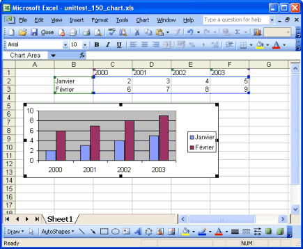
Below is the reproduction sample code charts_basic1.
Here are a few code samples to create native Excel charts. The first example shows how little code you need in order to create a chart. 3 lines of source code. The second example dives deeper into details. I am using C++ code, but you can use any of the languages supported by xlsgen, including VB, all .NET languages and Java.
| C++ code |
  // A barebone chart, leaving all automatic settings untouched
  xlsgen::IXlsChartPtr chart = wksht->NewChart(xlsgen::charttype_bar2D,
                                                     8, //row1
                                                     1, //col1
                                                     16, //row2
                                                     5 //col2
                                                 );
  chart->DataSource->SeriesInRows = TRUE;
  chart->DataSource->Range = L"Sheet1!R1C2:R3C6";
|

A barebone chart, leaving all automatic settings untouched

A 3D chart, custom formatted
| C++ code |
  // A 3D chart, custom formatted
  xlsgen::IXlsChartPtr chart = wksht->NewChart(xlsgen::charttype_area3D,
                                                     18, //row1
                                                      1, //col1
                                                     32, //row2
                                                      8 //col2
                                                 );
  chart->DataSource->SeriesInRows = TRUE;
  chart->DataSource->Range = L"Sheet1!R1C2:R3C6";
  chart->Legend->Show = xlsgen::chartlegend_hidden;

  // add, position and format a title
  chart->MainTitle->Label = L"a sample 3D chart";
  chart->MainTitle->Options->X = 80;
  chart->MainTitle->Options->Y = 5;
  chart->MainTitle->Options->Patterns->Borders->Shadow = TRUE;
  chart->MainTitle->Options->Patterns->Area->Type = xlsgen::chartareatype_automatic;

  // format the background chart area
  chart->SurfaceArea->Options->Patterns->Borders->RoundCorners = TRUE;
  chart->SurfaceArea->Options->Patterns->Borders->Type = xlsgen::chartbordertype_custom;
  chart->SurfaceArea->Options->Patterns->Borders->Style = xlsgen::chartborderstyle_dashdot;
  chart->SurfaceArea->Options->Patterns->Borders->Weight = xlsgen::chartborderweight_double;
  chart->SurfaceArea->Options->Patterns->Borders->Color = xlsgen::colorRed;
  chart->SurfaceArea->Options->Patterns->Area->Type = xlsgen::chartareatype_custom;
  chart->SurfaceArea->Options->Patterns->Area->Gradient->SingleColor->GradientStyle =
                xlsgen::gradientstyle_verticall0;
  chart->SurfaceArea->Options->Patterns->Area->Gradient->SingleColor->Color =
                0xDD8800;
  chart->SurfaceArea->Options->Patterns->Area->Gradient->SingleColor->LightThreshold =
                100;

  // format the first series with a gradient
  chart->SeriesByIndex[1]->Options->Patterns->Borders->Type = xlsgen::chartbordertype_none;
  chart->SeriesByIndex[1]->Options->Patterns->Area->Type =
                xlsgen::chartareatype_custom;
  chart->SeriesByIndex[1]->Options->Patterns->Area->Gradient->SingleColor->GradientStyle =
                xlsgen::gradientstyle_diagonalUp0;
  chart->SeriesByIndex[1]->Options->Patterns->Area->Gradient->SingleColor->Color =
                0x0000DD;
  chart->SeriesByIndex[1]->Options->Patterns->Area->Gradient->SingleColor->LightThreshold =
               100;

  // format the second series with a texture
  chart->SeriesByIndex[2]->Options->Patterns->Area->Type =
               xlsgen::chartareatype_custom;
  chart->SeriesByIndex[2]->Options->Patterns->Area->PredefinedTexture->TextureStyle =
               xlsgen::charttexture_WhiteMarble;

  // format the Z axis, and change the ticks
  xlsgen::IXlsChartAxisPtr y_axis = chart->YAxis[xlsgen::chartaxis_primary];
  y_axis->Options->Font->Italic = TRUE;
  y_axis->Options->Font->Bold = TRUE;
  y_axis->Options->Font->Color = 0x00DD0000;
  y_axis->MinorTicks = xlsgen::chartaxisticks_cross;
|
And this just scratches the surface of things. There are many objects to program against like data labels, data points, gridlines, and the learning curve is greatly reduced thanks to a composition metaphore used across the chart object model.
xlsgen documentation. © ARsT Design all rights reserved.